STOP 01 OF 12 · MAY 2008
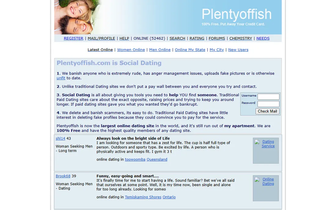
NO APP YET

ERA 01May 2008
A website first. Plentyoffish.com sold free online dating from Vancouver, under a header that told you to put away your credit card.
FIELD REPORT 09 · BRAND · PLENTY OF FISH, MATCH GROUP
Plenty of Fish was my home brand at Match Group. I was on its marketing team through three brand eras and owned paid acquisition for it. The 2022 relaunch opened with a gallery of portraits of men named Richard, and that campaign won a Webby for Best Growth Strategy.
THE NAME: PLENTY OF FISH2022 ONWARD




Plenty of Fish started in Vancouver in 2003 and has been part of Match Group since 2015. It was my home brand at Match. I rose from Digital Marketing Manager to Senior Digital Marketing Manager on it, a double promotion, and owned its paid acquisition across Meta, Google and Apple Search Ads.
The brand has worn three looks. In August 2011 PlentyOfFish moved to pof.com and shortened itself to POF. In September 2019 a flat angelfish replaced the glossy blue fish and the full name came back to the logo; the store listing followed within months. In October 2022 Plenty of Fish relaunched with a new identity, a new tagline and a launch campaign that won a Webby.
Agencies made the creative and they are credited here by name. This report covers the team side: what each era looked like, how the launch worked, and what I did in paid and in PR.
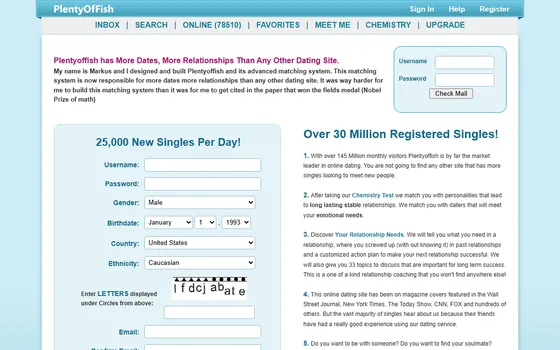
Twelve stops from 2008 to today. Each shows the homepage and the store listing as they were archived, with the icon and the logo of that moment. Pick a date, use the arrows or your arrow keys, or swipe the screen.
STOP 01 OF 12 · MAY 2008
A website first. Plentyoffish.com sold free online dating from Vancouver, under a header that told you to put away your credit card.
STOP 02 OF 12 · JUN 2010
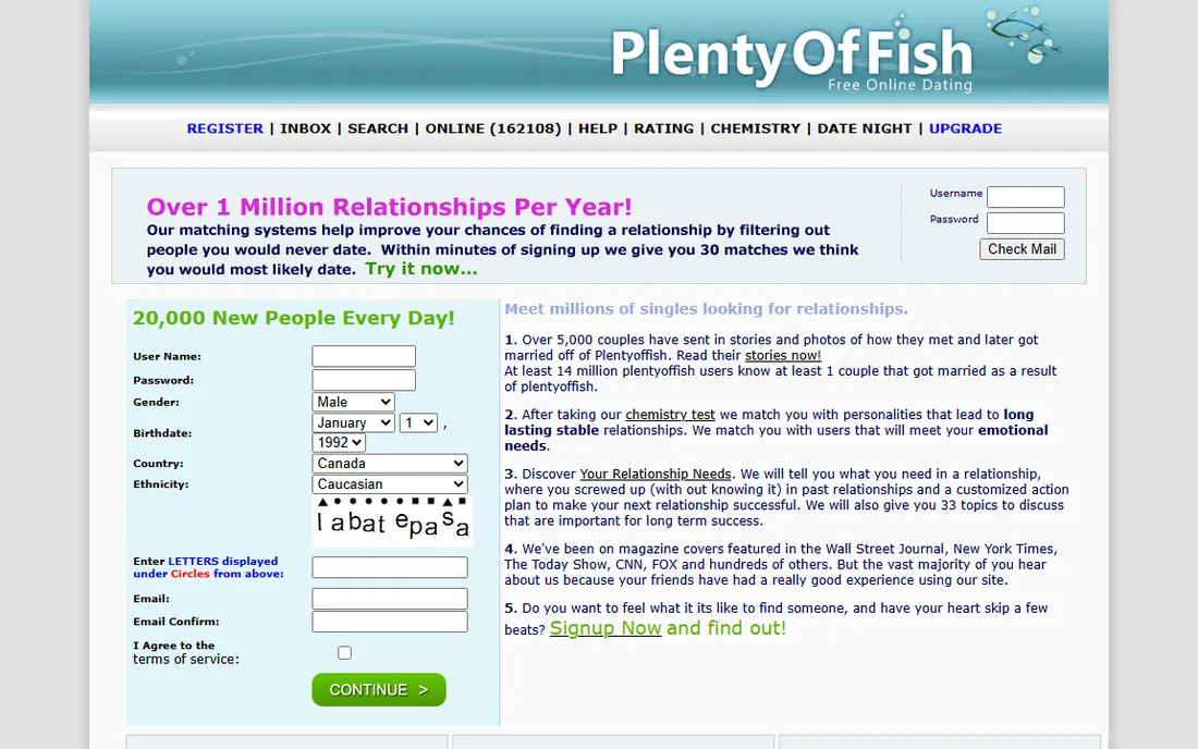
The glossy PlentyOfFish banner. The first iPhone and Android apps arrived this year.
STOP 03 OF 12 · DEC 2011
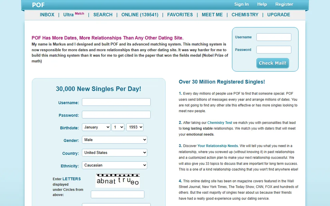

STOP 04 OF 12 · JUN 2013
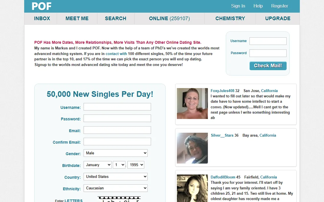
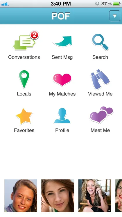
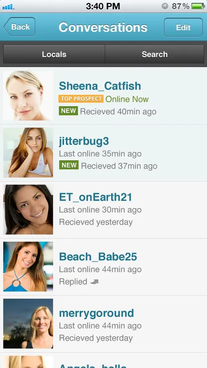


The app years in the POF look: glossy icons, and a store listing called POF Free Online Dating.
STOP 05 OF 12 · JUN 2017
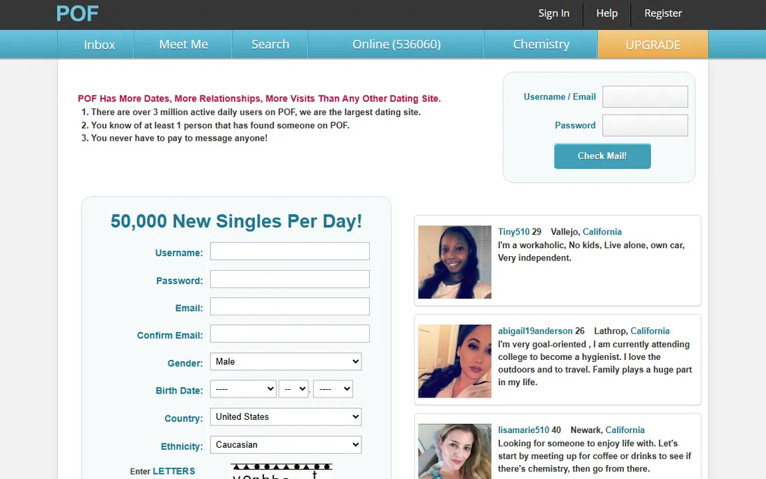
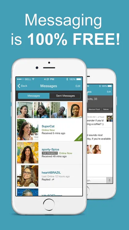
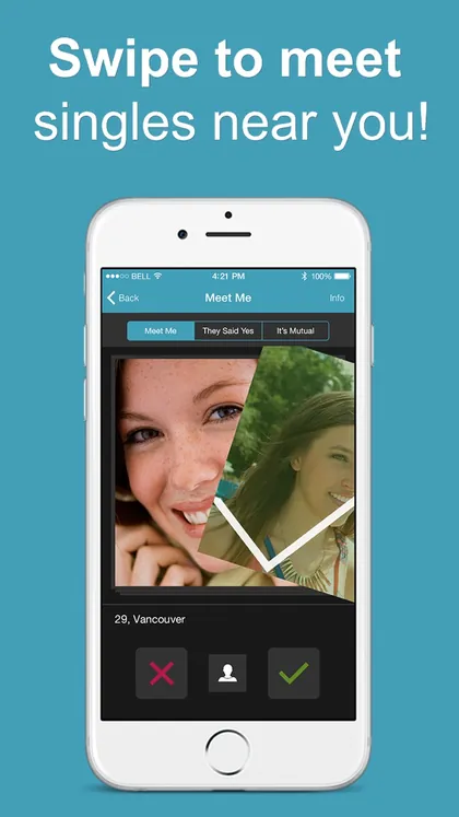

Flat design arrives. The store pitches free messaging and swiping, and the icon wears a FREE page curl.
STOP 06 OF 12 · AUG 2019
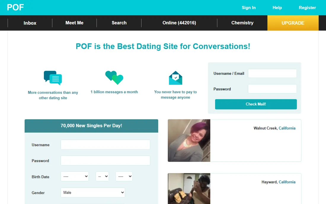

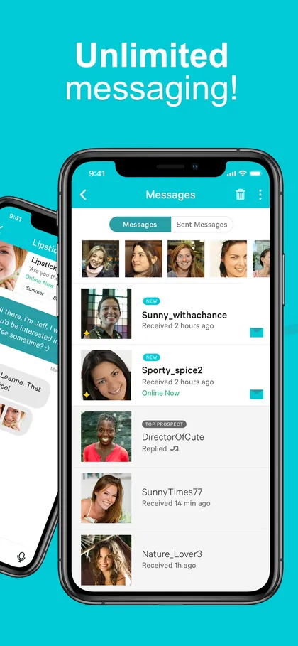

The last month of the POF look: turquoise, a white fish with a heart, and a pitch built on conversations.

STOP 07 OF 12 · NOV 2019
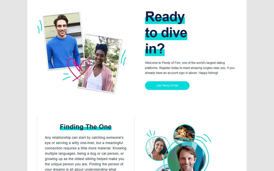


The angelfish launched on September 17, 2019, and the full name came back to the logo. By January the store listing read Plenty of Fish Dating.

STOP 08 OF 12 · JUN 2021
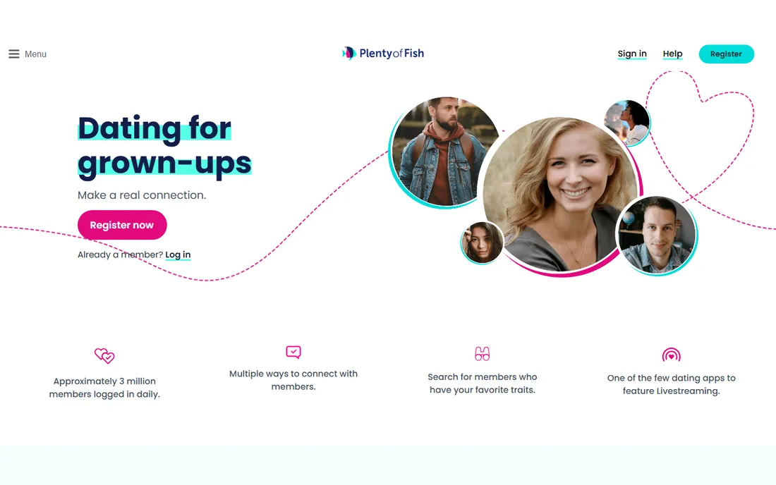
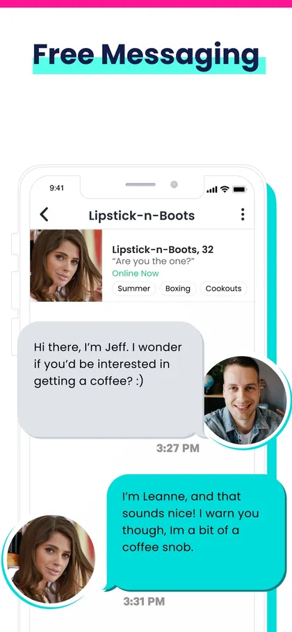
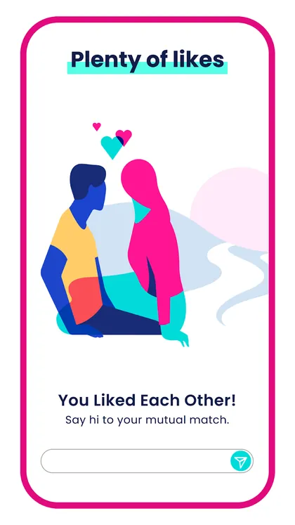
The homepage says Dating for grown-ups. On Google Play, flat illustrations and Plenty of lines show up a year before the relaunch.
STOP 09 OF 12 · OCT 2022
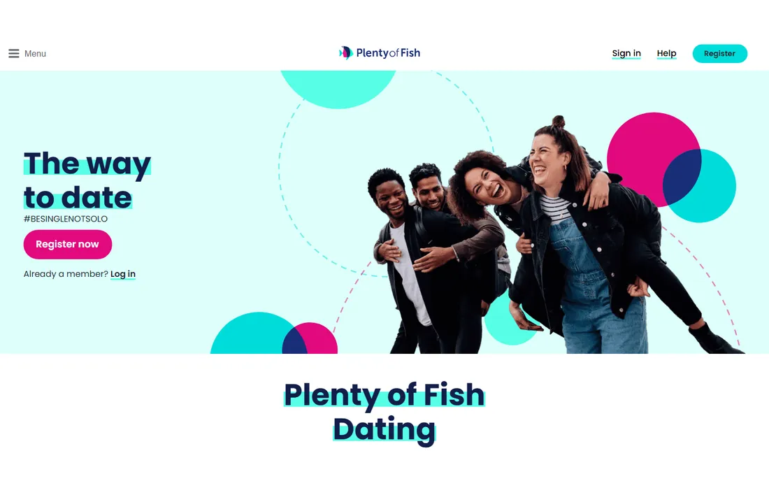


The last week of the angelfish: The way to date, #BESINGLENOTSOLO. The October 17 capture already shows the new site.
STOP 10 OF 12 · NOV 2022
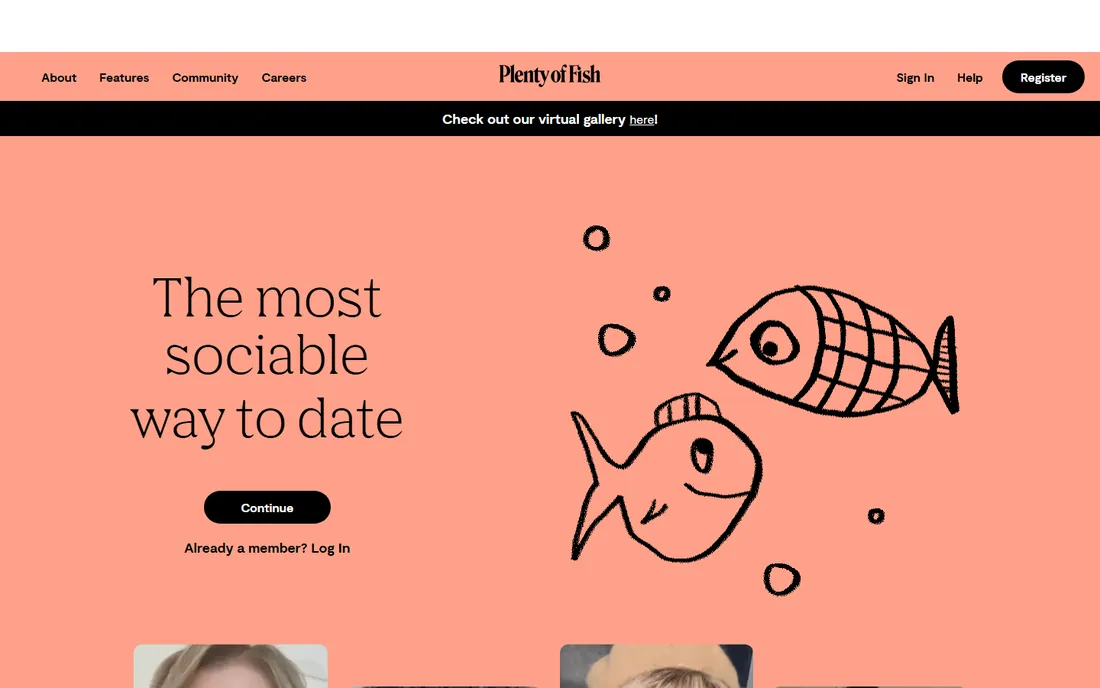
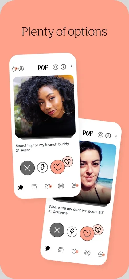
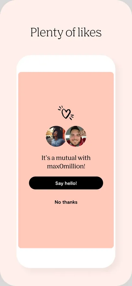


The relaunch: salmon, a serif wordmark, Plenty of lines in the store, and a bar on the homepage pointing to the virtual gallery.

STOP 11 OF 12 · AUG 2023
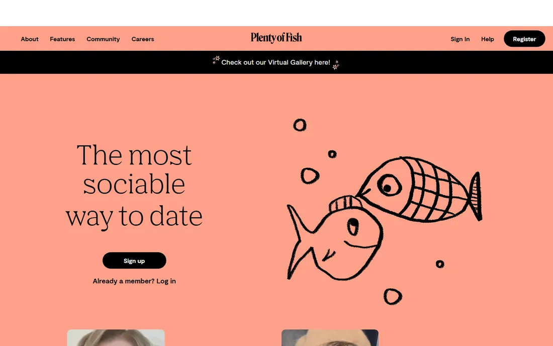
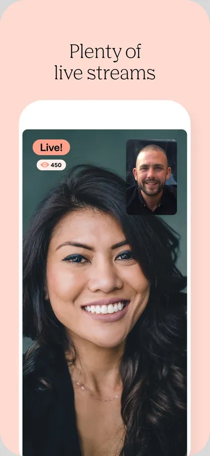
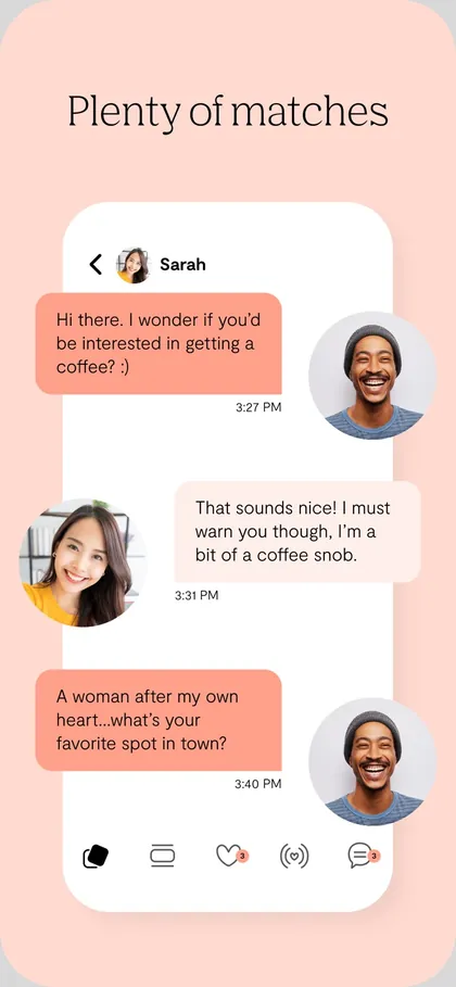
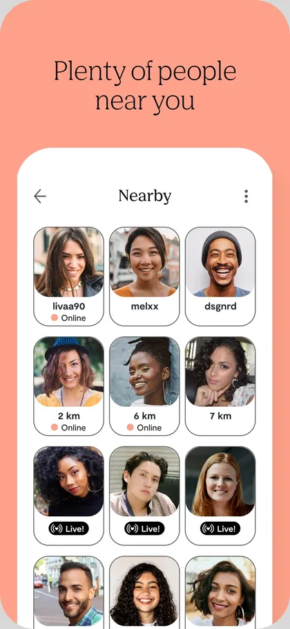

Settled in. The virtual gallery bar is still on the homepage in August 2023, and the store keeps the Plenty of lines.
STOP 12 OF 12 · 2026 TODAY
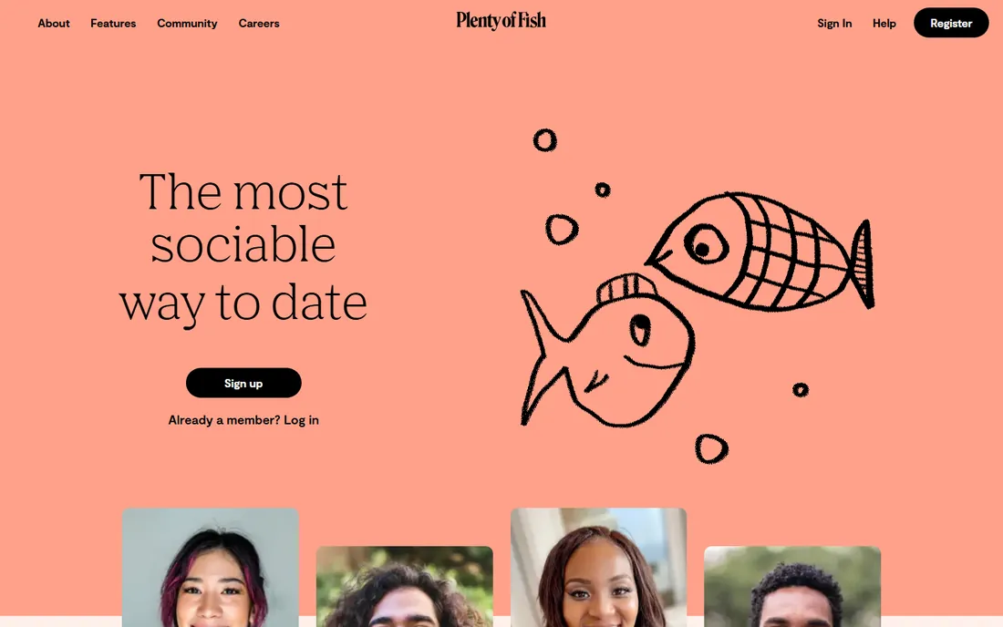
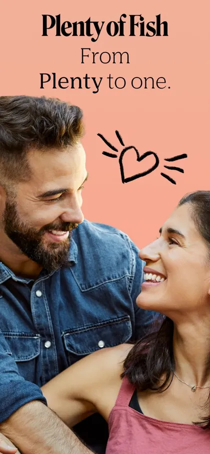
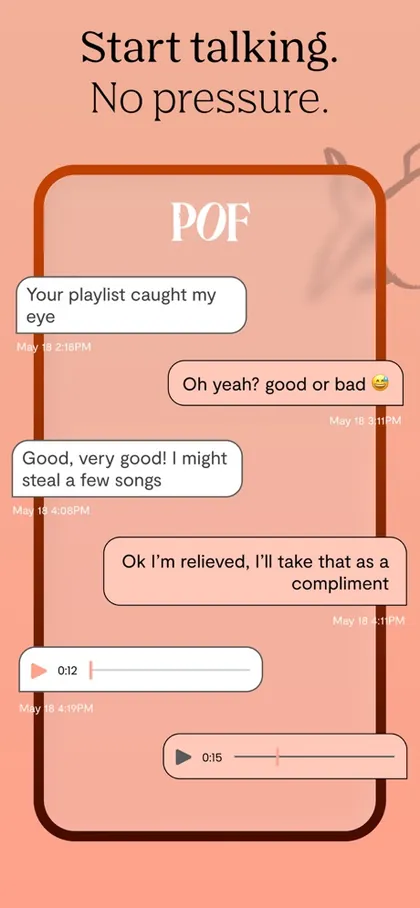
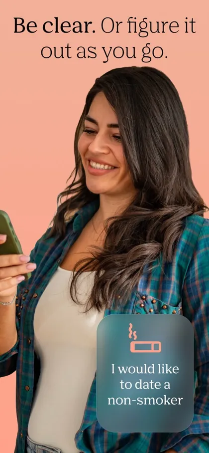

From Plenty to one. The wordmark, the salmon and the fish in the P all hold, and the homepage headline rotates one word: welcoming, friendly, sociable, playful, relaxed, fun.
Homepages are rendered from Wayback Machine captures at 1440 by 900 and show the first screen a visitor saw; older fixed width sites are cropped to their content. Store screenshots come from the brand's own App Store and Google Play listings on the capture dates shown. Every date links to its source.
Every mark here is the brand's own file, archived from pof.com and its store listings. Read left to right, top to bottom.

 2013Glossy fish with a heart2016Flat fish, FREE page curl2019White fish on turquoise2020The angelfish2023Serif P, fish in the bowlTODAYUnchanged since the relaunch
PlentyOfFish grew up as a website. In August 2011 it moved to pof.com and the logo shrank to three letters. Online Personals Watch covered the switch that November; its author, who counted POF as a client, argued that a short name is easier to remember and pass along.
THE GROWTH SIDEEight years is long enough for a short name to live in people's search habits. The store subtitle still carried POF in 2021 and 2023, and brand search had to answer to both names long after the logo changed.
On September 17, 2019 the glossy fish gave way to the angelfish, and the full name came back to the logo. Plenty of Fish's own launch post said the new fish redrew the original from overlapping circles in colorful layers, with bright colors meant to feel welcoming and low pressure.
THE GROWTH SIDEA store rename splits brand search. People kept typing POF while others started typing Plenty of Fish, so I kept both names covered in brand search and watched the query mix move. The angelfish then carried my paid creative until the 2022 relaunch.
Mrs&Mr rebuilt the identity with Plenty of Fish's internal designers. In a category full of pressure and performance, Plenty of Fish took the relaxed side: warm illustration and a playful voice, so meeting someone feels closer to real life. The launch release said the salmon pops on phones and in app stores, which is a growth argument as much as a design one.
THE GROWTH SIDENew identity, same launch day in paid: the salmon look went into the Meta, Google and Apple Search Ads work I owned, next to the store assets those ads point to. Then two early reads, brand search for the name and conversion on the new look.
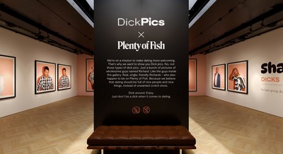
A rebrand needs a reason for people to look at it. The new mission was a more welcoming kind of dating, so the launch went after the least welcoming habit in online dating: explicit photos nobody asked for.
ONE23WEST answered with a virtual art gallery of dick pics. Every one is a tasteful portrait of a man named Richard, Richie or Dick. The gallery had themed rooms, a gallery statement, a history section and a gift shop. The joke carried a rule, and the rule shipped in the product as a No Dick Pic badge for profiles.
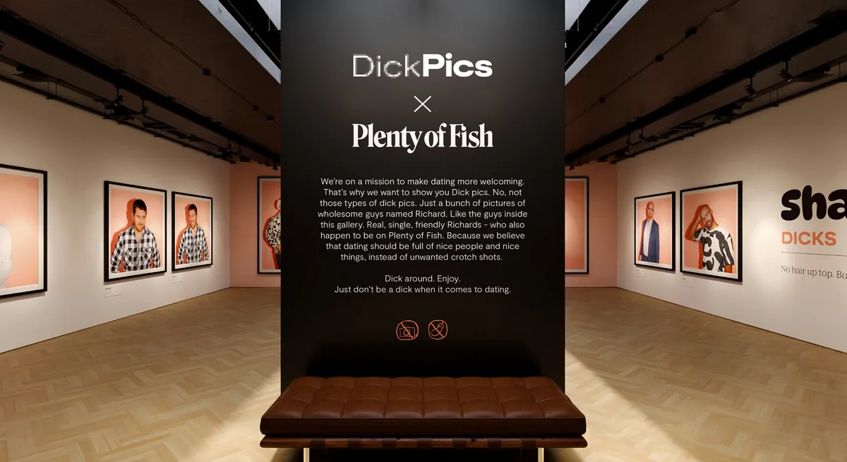
A schematic. The real gallery was a 3D website built by LNG Studios, with out of home in New York and a pop up gift shop in the real world. Rooms and route are drawn from the agency's description, not from the site's actual layout.
All from the 2023 award season. Both Webbys are in Best Growth Strategy: one chosen by the judges, one by public vote.
Award list as published by the campaign's creative director at ryansemeniuk.com. The awards went to the agency and the brand for the campaign. I was on the brand's team.
Credit first. Mrs&Mr designed the 2022 identity with Plenty of Fish's internal designers. ONE23WEST made the launch campaign, LNG Studios built the gallery, and Crafted Communications ran PR as the brand's agency of record.
My resume line is short: contributed to an award winning rebrand and a Webby winning growth strategy. Below is what that meant day to day, at the claim strength it deserves.
Paid is where many new users meet a brand first, so paid creative had to change when the brand did. The new logo, palette and voice went into the Meta, Google and Apple Search Ads work I owned, next to the app store assets those ads send people to.
A rename splits brand search, because people type the name they remember. When the store listing went from POF Dating to Plenty of Fish Dating, and again when the 2022 relaunch put the full name everywhere, both names stayed covered while the query mix shifted.
Two early reads after a launch: are people searching for the new name, and does the new look convert in the store and in onboarding. Brand search moves within days, so it is the first honest signal.
Match ran a PR department inside Marketing. I worked on Plenty of Fish's annual dating trends campaign, the Dine and Dish series, and the No Dick Pics campaign.
A new user meets the brand four times before the first match: an ad, a store listing, an icon, a first screen. If one of them lags on launch day, the journey shows two brands. Pick a scenario and count the seams.


Illustrative. The four surfaces are the real ones a new user passes through. The scenarios are examples of what goes wrong when one surface lags, not incidents from the 2022 launch.
Ship the store listing, the icon and the paid creative on the same day as the logo. A new ad that lands on an old listing looks like a different app.
Keep the old name in brand search until people stop typing it. They search for the name they remember, often for years.
Read brand search first after a launch. It moves within days and tells you whether the new name has landed before any survey does.
Dates and design details come from the launch press release, trade coverage and the agencies' own pages, listed below. Logos are public files and product shots are the brand's own store listings, archived. There are no private figures on this page; raw numbers stayed with Match Group.
Happy to walk through any of these live.